Flexbox
CSS Flexbox is an elegant and lightweight approach to layouts. It can be used without installing an extra frameworks or libraries.
It is a relatively new front-end feature that makes it easier to design flexible responsive layout structure without using float or positioning.
It is different from the regular layouts because you can lay out items inside a flex container in all possible directions. This means that your layouts can be organize top to bottom, bottom to top, left to right or right to left.
You can create a Flexbox layout by declaring a container using this property:
display : flexFlexbox uses a parent-child relationship so when you declare a flex container, the direct children of this container will automatically turn into flex items. However, it’s worth noting that this doesn’t apply for items: the children of flex items are not flex items.
Flexbox works on an axis grid.
Each one of the flexbox properties works either on the container or on the items, defining the way how items should be laid out inside the container.
Flex items can be laid out in all directions across their particular axis: left to right, right to left, top to bottom or bottom to top.
You can even change the order of the flex items without the need of altering the source order of your code.
Flex items can grow to fill the available space inside a container, or they can shrink to prevent overflow. Flexbox allows you to control how to handle this available space.
How Flex Works ?
- The flex container can change the width, height and order of it’s children.
- Items can grow to fill the available space.
- Items can shrink to prevent overflow.
- The available space will be distributed among the flex items.
Flex Axes
The flexbox contains 2 axes :
- main axis
- cross axis
The flex-direction property decides the main axis. The main axis can go in the directions as mentioned below.
- left to right
- flex-direction: row
- right to left
- flex-direction: row-reverse
- top to bottom
- flex-direction: column
- bottom to top
- flex-direction: column-reverse
The cross axis will always be perpendicular to the main axis.
Flex Direction
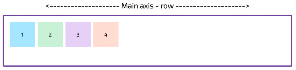
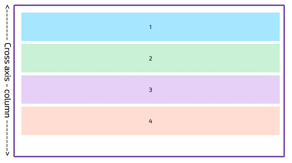
flex-direction: row
If you choose flex-direction as row or row-revere, then your main axis will run along the row in the inline direction (Image 1a) and the cross-axis will run top to bottom of the page in the block direction (Image 1b).
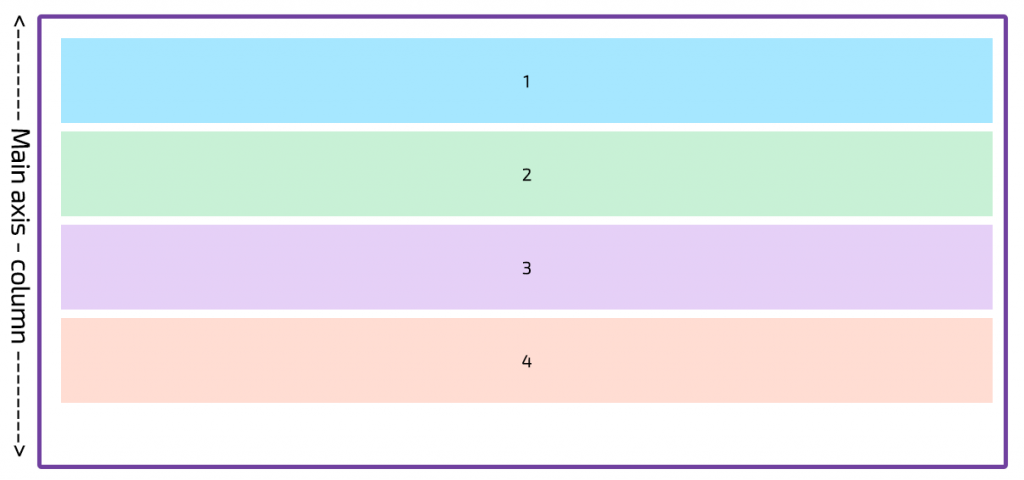
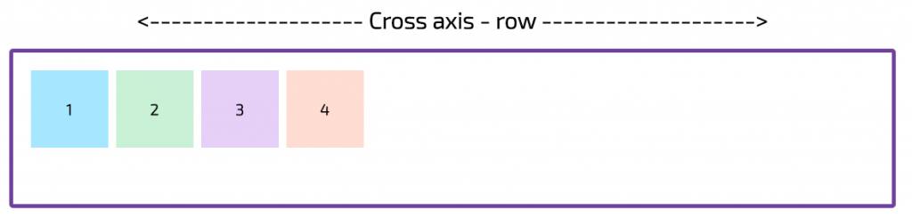
flex-direction: column
If you choose flex-direction as column or column-reverse, then your main axis will run top to bottom of the page in the block direction (Image 2a) and the cross axis will run along the row in the inline direction(Image 2b).
Example in codepen:
Flex Wrap
The flex-wrap CSS property sets whether flex items are forced onto one line or can wrap onto multiple lines.
If set to multiple lines, it also defines the cross-axis which determines the direction new lines are stacked in.
The flex-wrap property accepts 3 different values:
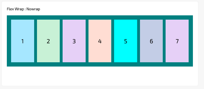
- nowrap (default)
The nowrap value indicates that the flex items will not wrap. The default value of wrap-flex is nowrap. Items wrap in single line which may cause the container to overflow
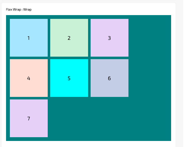
- wrap – wraps multi-lines, direction is defined by flex-direction. The flex items break into multiple lines. The cross-start is either equivalent to start or before depending flex-direction value and the cross-end is the opposite of the specified cross-start.
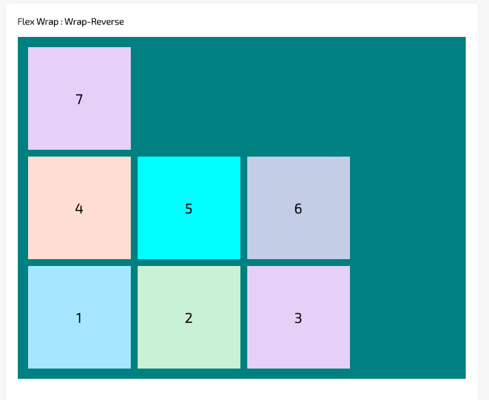
- wrap-reverse – Behaves the same as wrap but cross-start and cross-end are in opposite order. his property is used to reverse the flow of the flex items when they wrap to new lines.
Example in codepen:
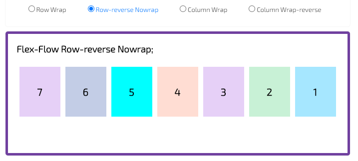
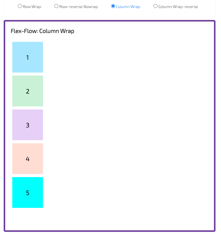
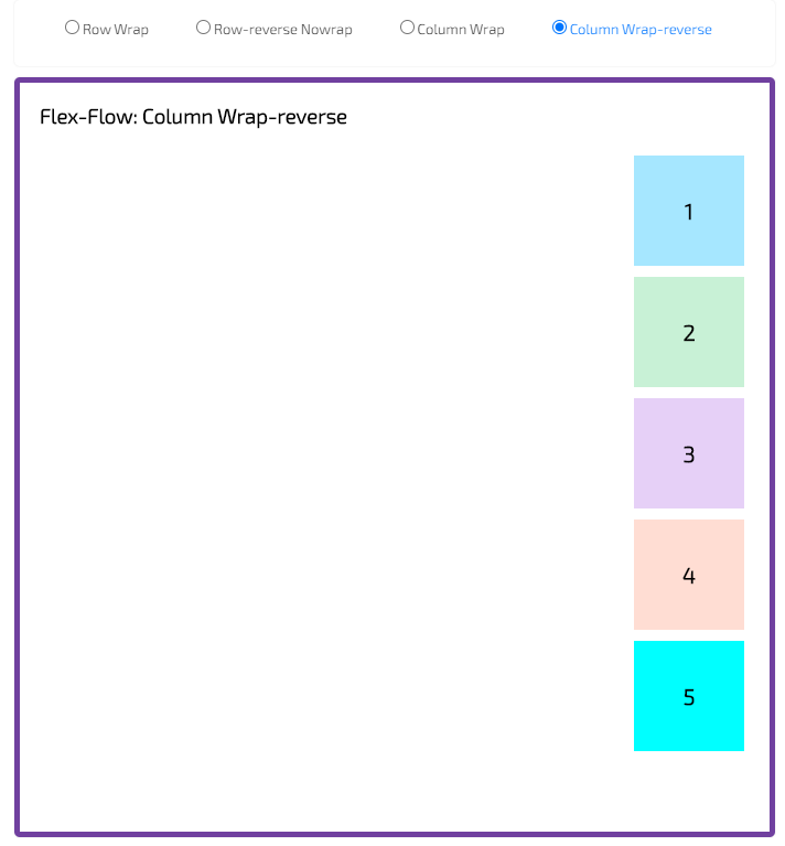
Flex Flow
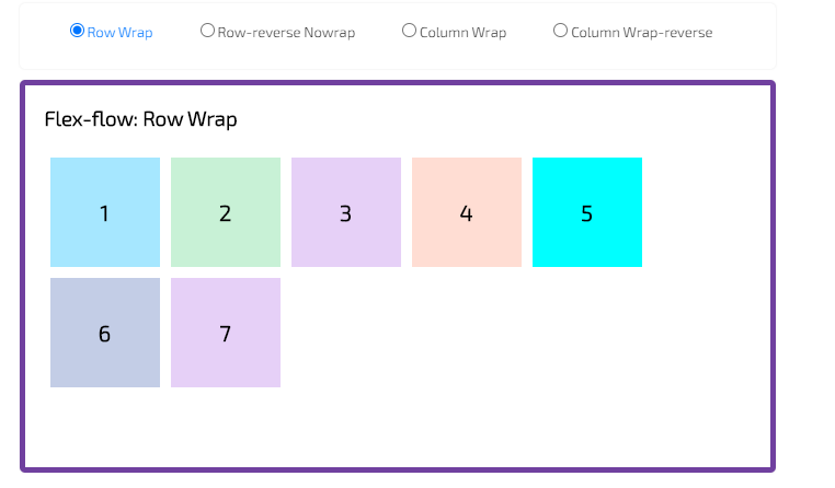
The flex-flow CSS property is a shorthand property for flex-direction and flex-wrap properties.
It together define the flex container’s main and cross axes. The default value is row nowrap.
- row-wrap
- reverse-row-wrap
- column-wrap
- column-wrap-reverse
Example in codepen:
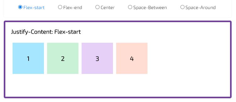
Justify Content
The justify-content property accepts 5 different values:
The justify-content property is used to align the flex items. It defines the alignment along the main axis. It helps distribute extra free space leftover when either all the flex items on a line are inflexible, or are flexible but have reached their maximum size.
- Justify-Content: Flex-start
Items are packed toward the start of the flex-direction (this is default).
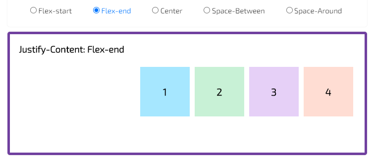
- Justify-Content: Flex-end
Items are packed toward the end of the flex-direction.
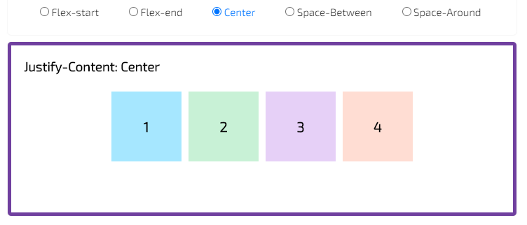
- Justify-Content: Center
Items are centered along the line.
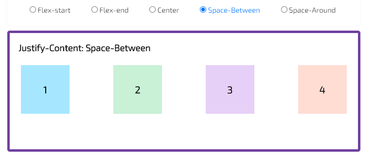
- Justify-Content: Space-Between
Items are evenly distributed in the line; first item is on the start line, last item on the end line.
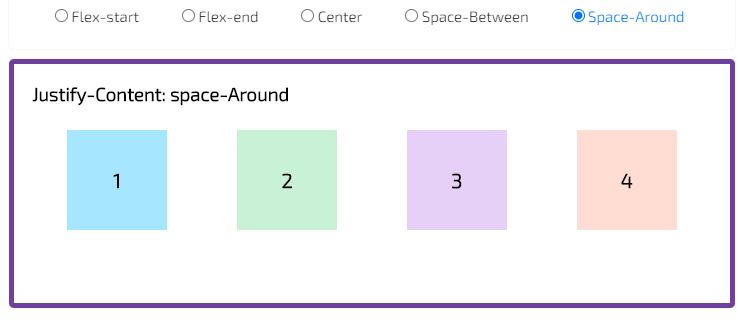
- Justify-Content: space-Around
Items are evenly distributed in the line with equal space around them.
Example in codepen:
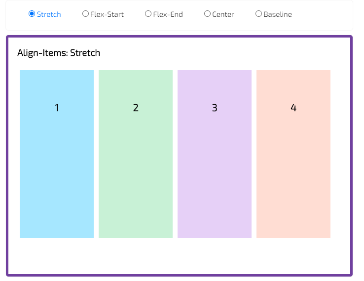
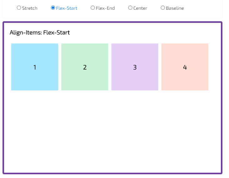
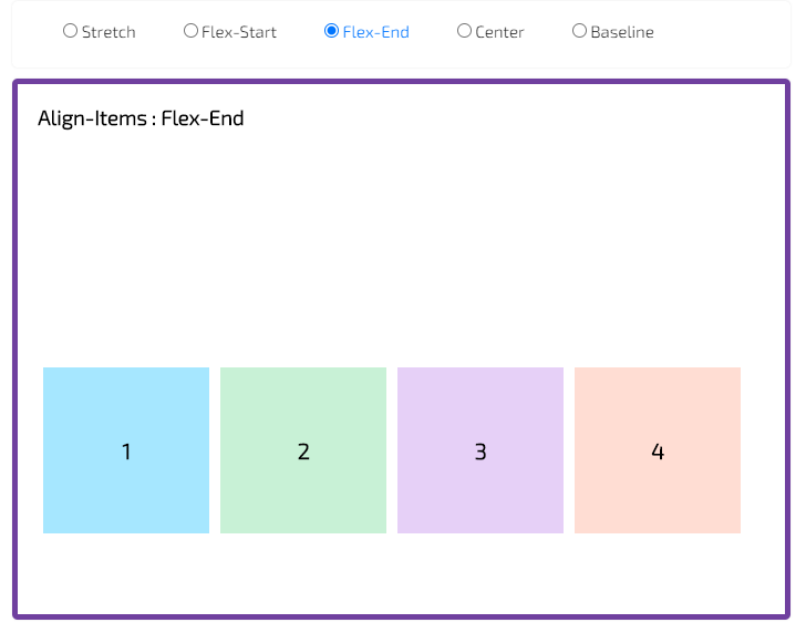
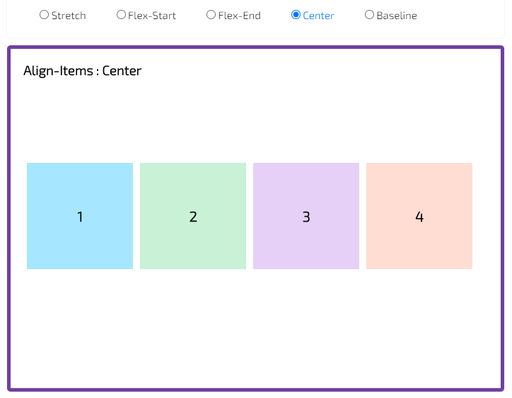
Align Items
The align-items property is used to align the flex items. It defines how flexbox items are aligned according to the cross axis, within a line of a flexbox container.
The 5 different values of align-items property is given below:
- Stretch
The flexbox items will stretch across the whole cross axis (this is default).
- Flex-Start
The flexbox items are aligned at the start of the cross axis. By default, the cross axis is vertical. This means the flexbox items will be aligned vertically at the top.
- Flex-End
The flexbox items are aligned at the end of the cross axis.
By default, the cross axis is vertical. This means the flexbox items will be aligned vertically at the bottom.
- Center
The flexbox items are aligned at the center of the cross axis.
By default, the cross axis is vertical. This means the flexbox items will be centered vertically.
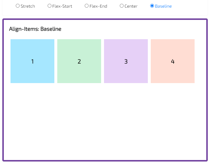
- Baseline
The flexbox items are aligned at the baseline of the cross axis.
By default, the cross axis is vertical. This means the flexbox items will align themselves in order to have the baseline of their text align along a horizontal line.
Example in codepen:
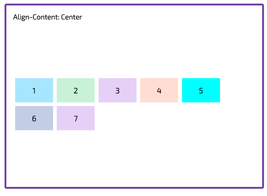
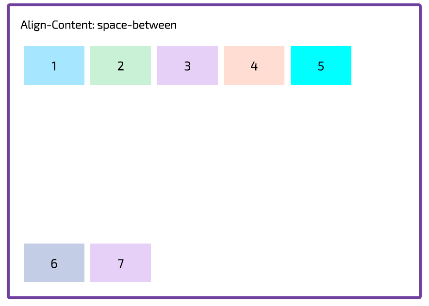
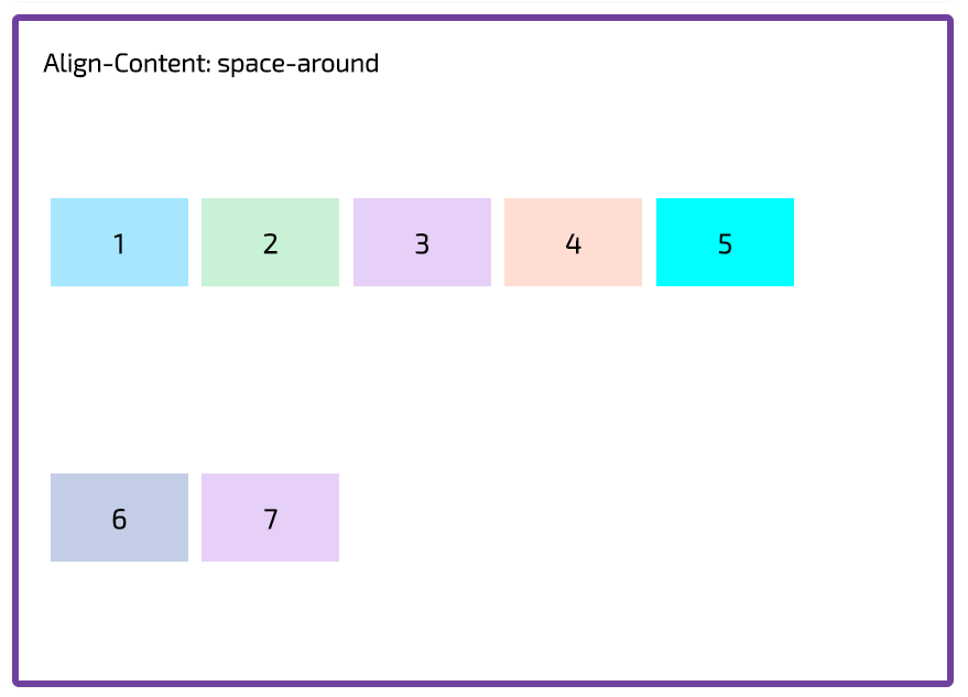
Align Content
The align-content property helps to align a flex container’s lines within it when there is extra space in the cross-axis, similar to how justify-content aligns individual items within the main-axis. Note, this property has no effect when the flexbox has only a single line.
The 5 different values of align-items property is given below:
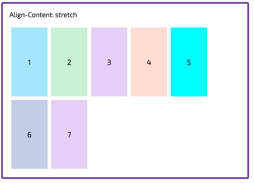
- Stretch
Each line will stretch to fill the remaining space.
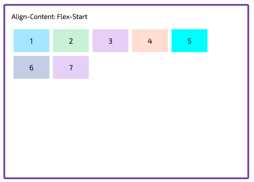
- Flex-Start
Each line will only fill the space it needs. They will all move towards the start of the flexbox/grid container’s cross axis.
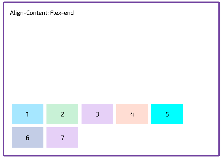
- Flex-End
Each line will only fill the space it needs. They will all move towards the end of the flexbox/grid container’s cross axis.
- Center
Each line will only fill the space it needs. They will all move towards the centre of the flexbox container’s cross axis.
- Space-between
Each line will only fill the space it needs. The remaining space will appear between the lines
- Space-around
Each line will only fill the space it needs. The remaining space will be distributed equally around the lines: before the first line, between the two, and after the last one.
Example in codepen:
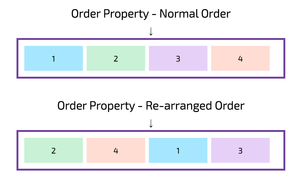
Order Property
The order property specifies the order of the flex child. Order property specifies the order in which a flex-child is displayed and laid out within a flex-parent.
The order value must be a number, default value is 0. The order property controls the order in which they appear in the flex parent.
Example in codepen: